Two tiles can look almost identical when you hold one sample of each in a showroom and feel completely different once they cover a shower wall, bathroom floor, or kitchen backsplash. The reason is that you are not really choosing one tile. You are choosing hundreds of repeated surfaces, grout joints, cuts, transitions, and reflections that will all be seen together in the lighting of your home.
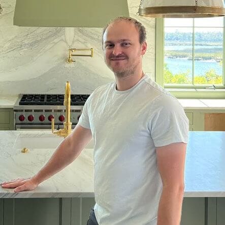
I’m Leo Lutskov, CEO and Construction Consultant at Alta Group Remodeling. Tile installation was one of the trades that shaped my early construction experience, and it taught me to look beyond the sample itself. Before we approve a tile for a remodel, I want to understand how much variation the collection has, how the pattern repeats, what the grout will do visually, how the surface will be lit, and whether the wall or floor underneath is prepared well enough for the installation. Those details determine whether the finished surface feels calm and intentional or much busier than the homeowner expected.
One Sample Cannot Show You the Finished Surface
Tile collections vary more than many homeowners realize. Some ceramic and porcelain products stay fairly uniform from piece to piece, while others are designed to mimic marble, wood, concrete, or handmade materials. That can mean different shades, textures, veining patterns, and printed faces within the same collection.
Printed faces are a good example. I have seen tiles around $2 per square foot and others around $7 per square foot that looked remarkably similar in isolation. One difference can be how many unique faces the manufacturer includes. If one collection has only three printed faces, those same markings repeat frequently across a large wall. A collection with eleven faces repeats much less often and can look more natural when everything is installed together. That does not automatically make the more expensive tile better, but it can explain why two materials that seem almost identical in the store produce very different finished surfaces.
This is why we review several pieces and, when appropriate, more than one carton before installation. We also check production information because different dye lots can vary slightly in color and different calibers can affect dimensions. Ordering extra material later can become a problem if the original batch is no longer available.
Light and Viewing Angle Can Change the Color More Than You Expect
A tile that looks neutral in a showroom may look cooler, warmer, brighter, or more textured once it is installed at home. Daylight can reveal undertones that were difficult to see under retail lighting, while warm interior light can bring out cream or beige tones. Glossy surfaces reflect windows, cabinetry, plumbing fixtures, and surrounding colors, while matte tile usually reads more quietly.
The orientation matters too. Wall tile is viewed closer to eye level, so its texture, grout lines, and finish are more direct. Floor tile is usually seen from above and at an angle, often interrupted by cabinetry, rugs, vanities, or fixtures. The same material can therefore feel much stronger on a wall than it did lying flat on a sample table.
Whenever possible, I want to see the tile in the actual room. We look at wall tile vertically and floor tile flat, with daylight and the planned interior lighting. Western Washington makes this especially useful because a room can feel very different on a bright afternoon and on an overcast morning.
Tile Size Changes the Rhythm of the Entire Room
Large-format tile has become popular because fewer grout lines can create a clean, continuous surface, but larger is not automatically better. Room dimensions still determine where the cuts land, and an oversized tile can leave narrow strips at walls, drains, niches, or doorways if the layout is not planned carefully.
A smaller tile creates more joints and a stronger visual rhythm. That can work beautifully on shower floors, niches, backsplashes, or accent areas, but the same pattern across a large wall may feel much busier. Tile size also affects maintenance because more joints mean more grout.
Layout adds another layer. A straight grid tends to feel calm, while herringbone, diagonal, or offset patterns create more movement and require more cuts. Long rectangular tiles may also have natural curvature, which can make certain offsets show height differences more clearly. We follow the product requirements rather than assuming the most complicated layout is the best one.
I explain these relationships in more depth in our full guide to why similar tiles can look different after installation, including dye lots, tile size, lighting, grout, lippage, and layout planning.
Grout Can Make the Tile Feel Like a Different Material
Grout is one of the most underestimated design decisions in tile work. A grout color close to the tile lets the surface read more continuously and can soften variation. A contrasting grout outlines every piece and makes the geometry much more visible.
Neither approach is automatically better. The question I ask is whether the homeowner wants to notice the tile surface first or the pattern created by the joints.
Joint width matters too. Narrow joints can look very precise, but they require tile dimensions, edge conditions, substrate preparation, and manufacturer guidance that support that decision. Handmade or irregular tile may need wider joints because the edges and dimensions naturally vary. Rectified tile offers more precise dimensions, but it does not guarantee invisible joints or a perfectly flat finished surface.
The grout decision also has to account for the actual application. Color is only one part of it. Joint size, maintenance, stain resistance, and performance all matter, especially in wet areas.
The Wall or Floor Under the Tile Can Decide How Good the Finish Looks
A beautiful tile cannot compensate for a surface that is not properly prepared. If a wall or floor is not sufficiently flat, the finished installation may show uneven edges even when the tile itself is high quality.
The technical term for differences in height between neighboring tile edges is lippage. Several things can contribute to it, including natural tile warpage, substrate irregularities, mortar application, the selected pattern, grout-joint width, placement, and lighting. Directional light can make even small height differences easier to see because it throws shadows across the surface. This is why I do not like promising extremely narrow joints or perfectly flat-looking installations based only on the fact that a tile is rectified. Before installation, we evaluate the tile and the substrate together. If additional preparation is needed, I would rather explain it while the surface is accessible than have the homeowner discover every irregularity after the tile is installed.
The existing structure matters as well. A remodel that adds much more tile than the original room had may require us to look more closely at the framing, subfloor, and movement in the structure. Excessive movement can contribute to cracked tile or grout over time, and some assemblies may need additional preparation or reinforcement before they are ready for the new finish.
The Best Tile Choice Has to Work With the Rest of the Room
Two neutral materials can look good separately and still fight each other when installed together. One may lean warm while another leans blue or gray. That difference can become much more obvious once the tile is surrounded by cabinetry, countertops, paint, metal finishes, glass, and flooring.
In a bathroom, I look at the vanity, countertop, plumbing finishes, glass, floor, and wall color together. In the kitchen, I want to see the cabinetry, counters, hardware, and flooring. Matching everything is not the goal. The materials need some relationship through tone, texture, scale, or intentional contrast.
The tile also needs a role. If it is supposed to be the focal point, the surrounding finishes may need to become quieter. If a stone countertop, cabinetry, or fireplace already carries the visual weight, a simpler tile can create better balance.
Our Luxury Master Bathroom Shows Why Tile Has to Be Planned as a Whole Surface
Alta’s Luxury Master Bathroom is a useful example because one geometric tile pattern continues through the shower and behind the freestanding tub. The material is the same, but the result does not look identical in both places.
The shower has glass, niches, plumbing fixtures, corners, and different lighting conditions. The tub wall has a different scale, viewing angle, and relationship to the surrounding finishes. The same tile therefore changes character as it moves through the room.
We paired the stronger wall pattern with a quieter floor so the room did not become visually overloaded. The important part was resolving the cuts, corners, niches, glass, exposed edges, and surrounding finishes before installation rather than treating the tile as a decorative layer that could be figured out at the end. That is also why we review the final tile plan before setting begins. The homeowner does not need to calculate the layout, but they should understand the direction, starting point, grout color, joint width, visible cuts, transitions, and exposed edges before those decisions become permanent.
Homeowners planning tile as part of a bathroom, kitchen, fireplace, or flooring remodel can see more of our work and planning approach at Alta Group Remodeling.
Leo Lutskov Explains What Makes Tile Look Right After Installation
The Stone Magazine (TSM): Leo, what is the biggest mistake homeowners make when choosing tile?
Leo Lutskov (LL): Looking at one piece and assuming that is what the whole wall will look like. You need to understand how much variation there is and how often the same pattern repeats.
TSM: Can a more expensive tile actually look better even if the samples are almost identical?
LL: It can, but price by itself does not guarantee anything. One difference may be that the collection has more printed faces, so the pattern repeats less. That can matter a lot across a large surface.
TSM: Why does the same tile look different at home than it did in the showroom?
LL: Lighting and surroundings. Your windows, paint, cabinets, fixtures, and artificial lighting all affect what you see. I like to review the sample in the actual room whenever possible.
TSM: Can grout really change the appearance that much?
LL: Absolutely. Matching grout can make the surface feel much calmer. Contrasting grout outlines every tile, so the pattern becomes much stronger. You should decide which effect you want before installation.
TSM: Are large-format tiles always cleaner-looking?
LL: They can be because there are fewer grout joints, but the room dimensions still matter. You do not want a layout that creates awkward narrow cuts just because the tile is large.
TSM: What is lippage?
LL: It is the height difference between adjacent tile edges. Some variation can come from the tile itself, and some comes from the substrate, mortar, pattern, joint width, or installation. Strong directional light can also make small differences much easier to see.
TSM: Does rectified tile solve that problem?
LL: No. It gives you more precise dimensions, but the substrate and installation still matter. Rectified does not mean you can automatically use an extremely narrow joint or expect every edge to disappear.
TSM: Why do you care so much about the substrate if the homeowner only sees the tile?
LL: Because the finished surface reflects what is underneath it. If the wall or floor is not prepared correctly, the tile can show those problems for years.
TSM: What should homeowners approve before installation begins?
LL: The material, direction, layout, visible cuts, grout, transitions, and exposed edges. Those are much easier to discuss before the first tile is set.
TSM: How do you know when a tile design is becoming too busy?
LL: I look at the whole room. If the tile has a lot of movement or pattern, I may make the floor or surrounding finishes quieter. The goal is not to make every surface interesting on its own. The room has to work together.